


Case Study:
Hess Oil + Gas
The Ask
Hess was utilizing a decades old oil well planning platform built on Microsoft Access. At the time of this project, the developer was set to retire, and a new modern platform was needed to ensure the future stability and ease of well design.
The Hess team considered four options to re-design and potentially re-platform the system:
Face-Lift
1:1 Rebuild
Refactor Rebuild
Buy + Build
Our job was to ask and answer the question: “How might we leverage human-centric research methodologies and design to help determine the best path forward for the WFP redesign project?”
To move quickly and efficiently, we decided on using one persona and workflow from E2E to help determine the best implementation plan.
Design Goals
Our end goals for this project were the same no matter what Hess ultimately decided on -
Intuitive
Users should be able to easily find the information they need in a way that makes sense to them.Streamlined
The platform should reduce the amount of time and effort needed to complete tasks and be aware or circumstances within the data record.Personalized
Professionals value the ability to personalize their experience and tune it for optimum efficiency and productivity.Permissions
The system should support visibility while preventing errors through sensible, well-defined permissions and change-logs.
Main View
Challenges We Identified
Organization (IA)
The organization of the containers appears tied to a Visio workflow with no real organizational context
Buttons to open forms and links to other pages are identical; no hierarchy
Inconsistent labeling and naming conventions
Yo-yo navigation sty
Situational Awareness
No help for users in terms of knowing where things stand or what to focus on; it’s all navigation
No attention to visual weight or visual hierarchy; the page is difficult to scan and difficult to mentally order
What We Solved
Intuitive global navigation (as per web conventions) organized by role
Allowance for user profiles and sessions (necessary for logging) and personalization
Secondary navigation options for additional features that need consideration
Navigation is removed from the main content area of the screen, making space available for charts and lists that help users know where things stand and what is important next.
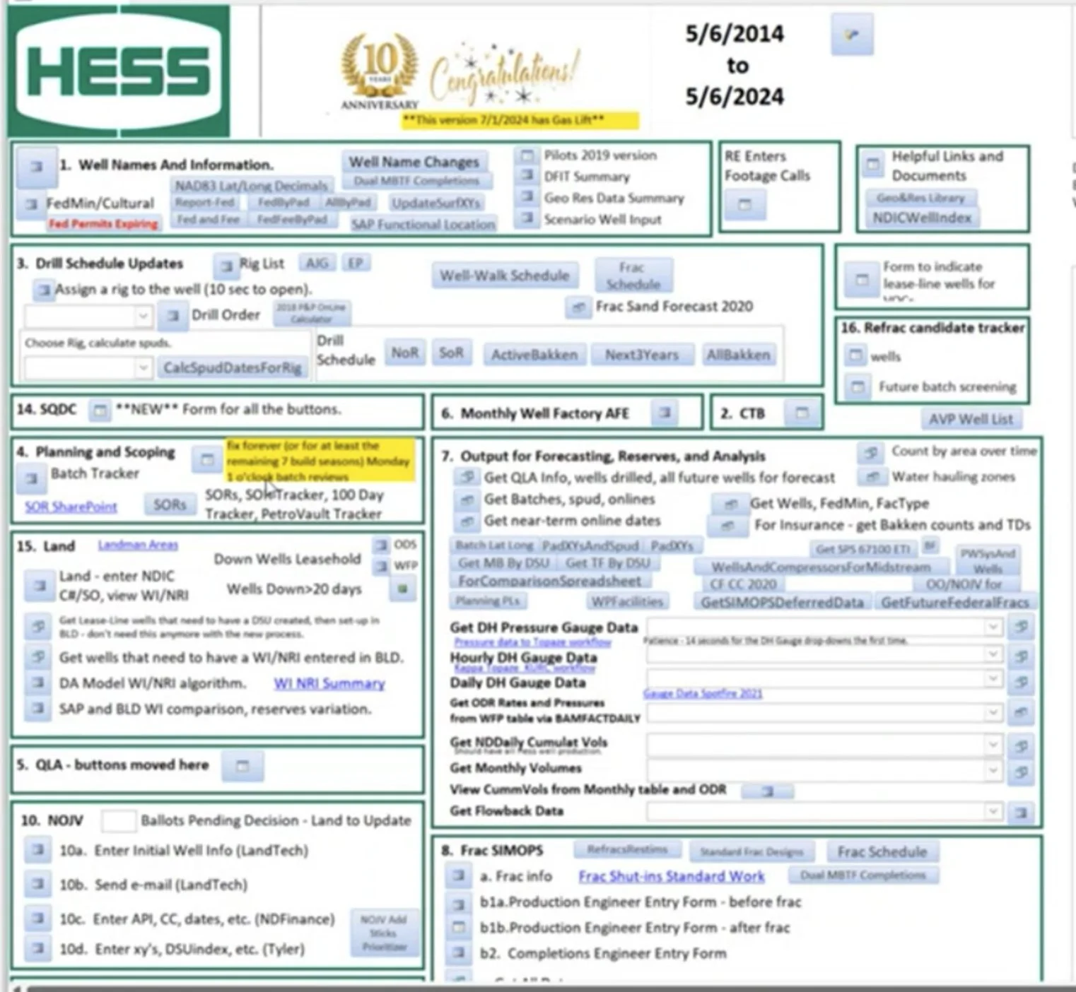
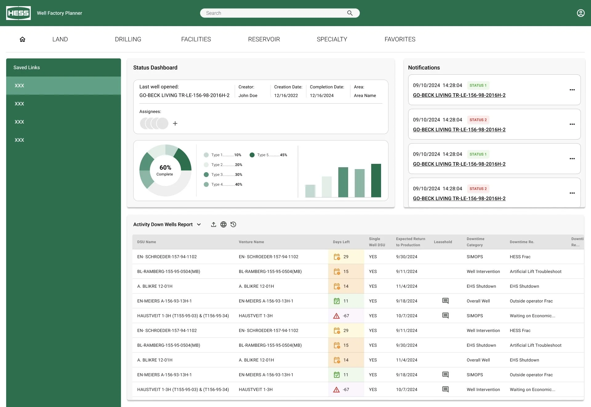
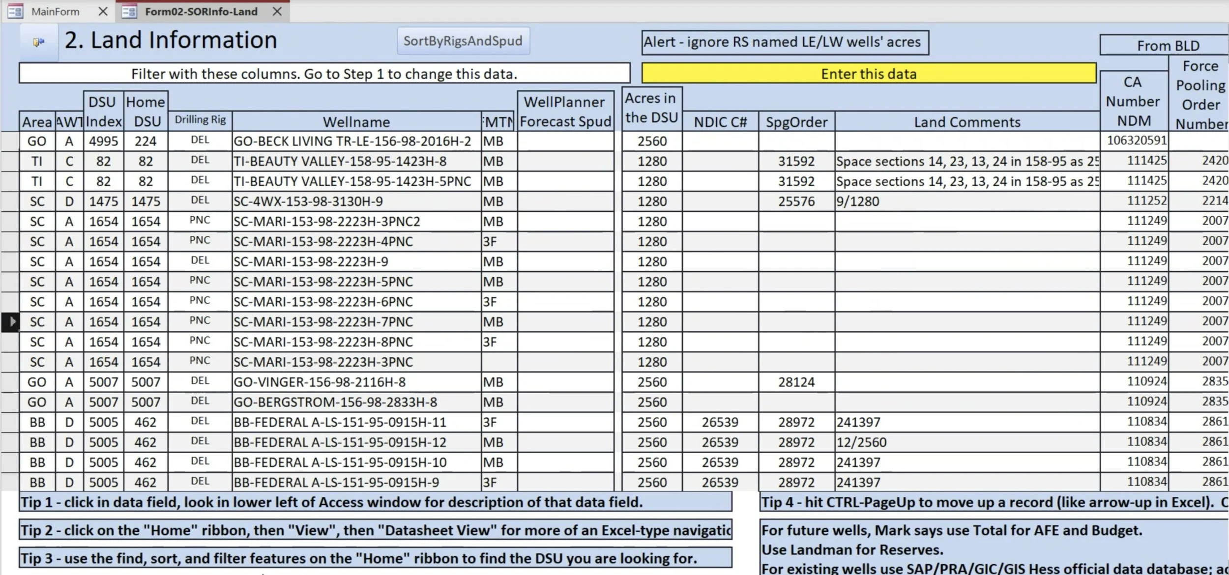
Table and Form: Navigate | View | Edit
Challenges We Identified
Interaction Patterns
Single-cell editing
Basic table functionality
No differentiated cell or table “states”
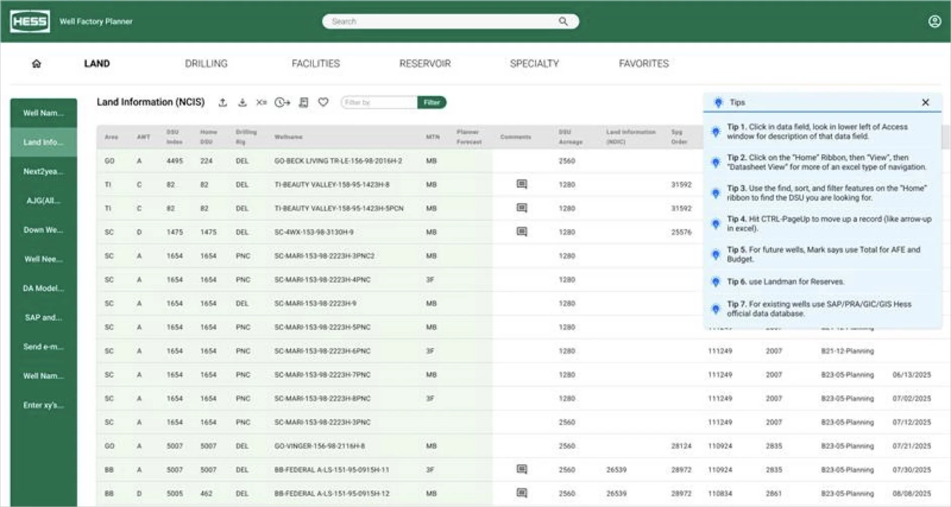
Fragmented and static “Tips”
Heavy lines and font (visual weight)
Unhelpful Zebra shading
Inconsistent column header height
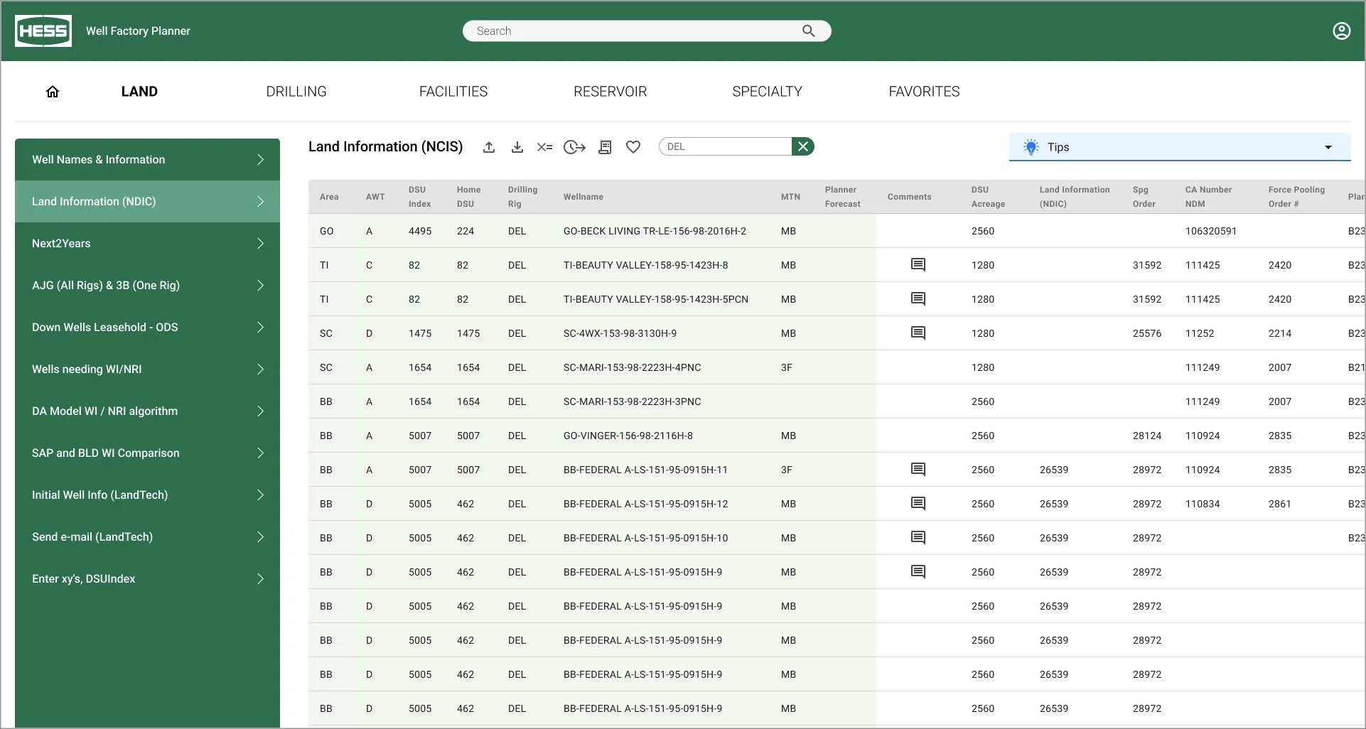
Navigation
For functional teams, cross-navigation between primary tables
Auto-collapsing left navigation optimizes horizontal space
Common Web Table
Standard icon toolbar gives access to tools and functionality
Read-only states show which fields to focus on for input/editing and which are for reference
Light visual weight makes it easier to focus on data, not cell borders
Tips and Instruction
Instead of keeping instructions static and visible, we chose to collect and collapse them as shown.
They are easily viewed by anyone needing guidance
They are out of the way for veterans who know their stuff
What We Solved
Single-value and Multi-cell Editing
Web tables support single and multiple-cell editing. The copied data can be within the table or from an external source
Single Row Shading (Hover)
Row shading on hover or selection is an easier way for users to scan across wide tables
Right Contextual Pane: Comments | Change Log
What We Solved
Comments


Custom Developed Solution
Creating a customized solution is usually more expensive to build than a non-customized off the shelf solution but there are advantages:
The client own the code, so there are no recurring licenses, and they control the end of life.
It fits your organization like a tailored suit.
The client controls the scope, so it doesn’t need to be overloaded with a lot of features users don’t value.
Depending on how it is designed and built, change management can be minimized.
What We Solved
Replacement Value
When multiple cells in a column are selected, and the action is invoked (icon clicked), a Replacement Value dialog prompts the user to enter (or paste) a replacement value. This value will replace any existing or null value.
The Replacement Value field is contextual to the data type. If replacing dates, a date field is shown. If a validated (drop-down) value, then a corresponding drop-down with the valid values.
Relative Date Changes
Planning often involves moving a date forward or back to align with changing circumstances. Hess needs a version that can move multiple dates and still preserve their relative position to each other. An example would be pushing back all well dates associated with a single pad.
When users select the dates they want to move, and then invoke the toolbar control, a dialog asks for the date move direction (forward or back) incrementally.
Example: Push all these dates back 1 month from where they are individually.
CONSIDERATIONS FOR BUY vs BUILD
Off the Shelf – Customized
VS
If heavy or even light customization is needed to make off the shelf solution fit the need, this was not advisable.
The client incurs technical debt. Every time there’s a new release it needs to be thoroughly tested to ensure it does not break any customization. The more customization the more testing.
Customization can be quite expensive. There’s still a lot of development and testing to be done.
Customization need to be permitted. Some SaaS vendors won’t customize because it breaks things for their existing customers.
Comment threads displayed in a single cell are ineffective for many reasons. We devised an interaction pattern that allows for multiple comments pertaining to a single record to be timestamped and shown as a threaded conversation.
The icon indicates that comments are available to view. (This could also include a counter if helpful.)
To add a new initial comment, we show a ghost comment icon on hover. When a user clicks the right pane is opened and the user enters the initial comment, whereupon the comment icon is displayed in the cell.
Change Log
Comment threads displayed in a single cell are ineffective for many reasons. We devised an interaction pattern that allows for multiple comments pertaining to a single record to be timestamped and shown as a threaded conversation.
The icon indicates that comments are available to view. (This could also include a counter if helpful.)
To add a new initial comment, we show a ghost comment icon on hover. When a user clicks the right pane is opened and the user enters the initial comment, whereupon the comment icon is displayed in the cell.